All Aboard!
Deep Dives
Explore related topics with these Wikipedia articles, rewritten for enjoyable reading:
-
Tyco Toys
1 min read
The article centers on Tyco's visual identity and catalogs but doesn't explain the company's history. Readers would benefit from learning about Tyco's rise as a major toy manufacturer, their competition with Lego, and their eventual acquisition by Mattel.
-
Ligature (writing)
1 min read
The author specifically highlights the ligatures in Tyco's logo as a key design feature. Understanding the history and typography principles behind ligatures would deepen appreciation for the design choices discussed.
-
Internet Archive
14 min read
The article mentions the Internet Archive as the source of the Tyco catalog collection but doesn't explain this remarkable nonprofit. Readers would benefit from understanding its mission, scale, and importance to preserving digital and physical media history.
Today’s guest issue is from Vedad Siljak, a type designer running Chill Type from Salzburg, Austria, as well as a fellow archive enthusiast who discovered a treasure trove of toy catalogs.
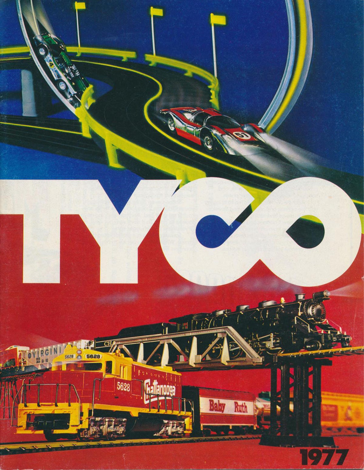
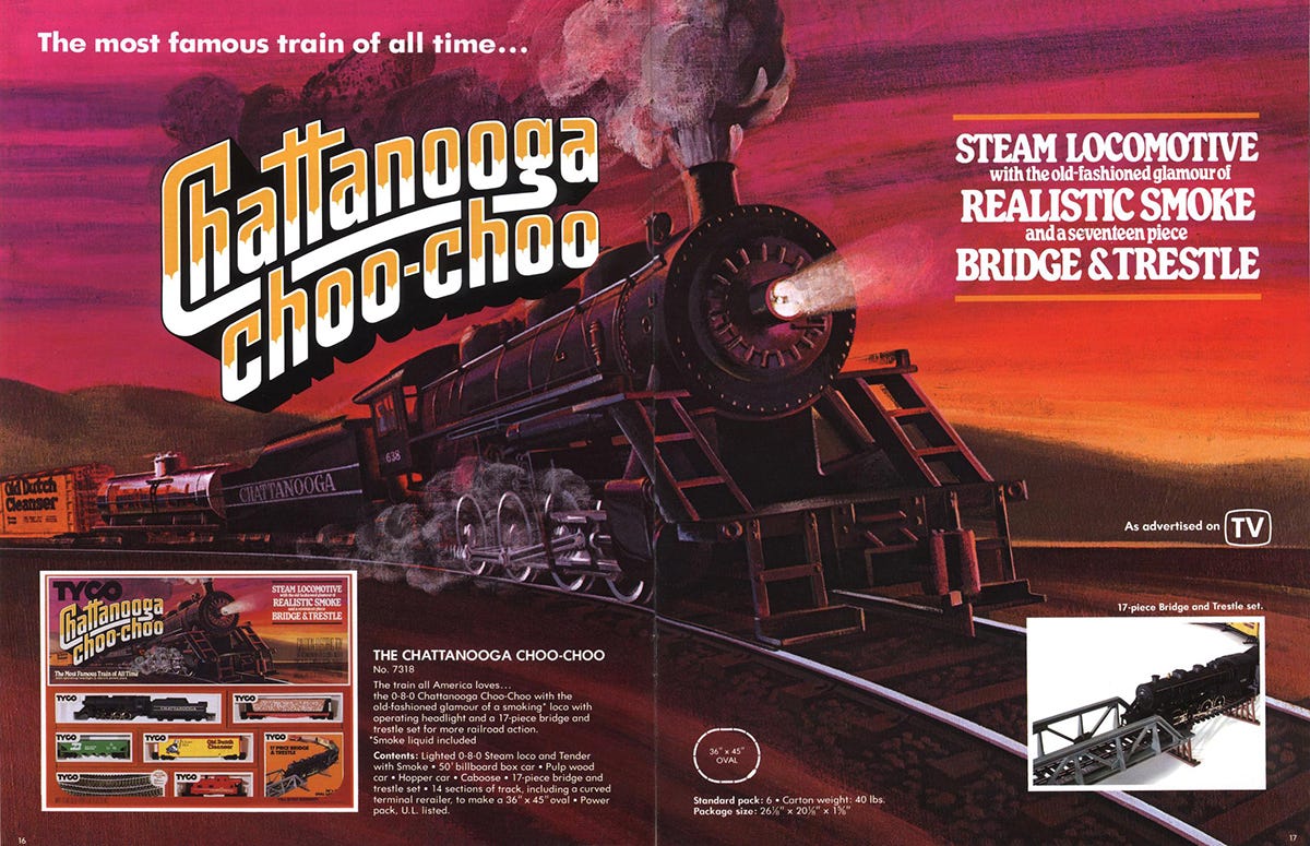
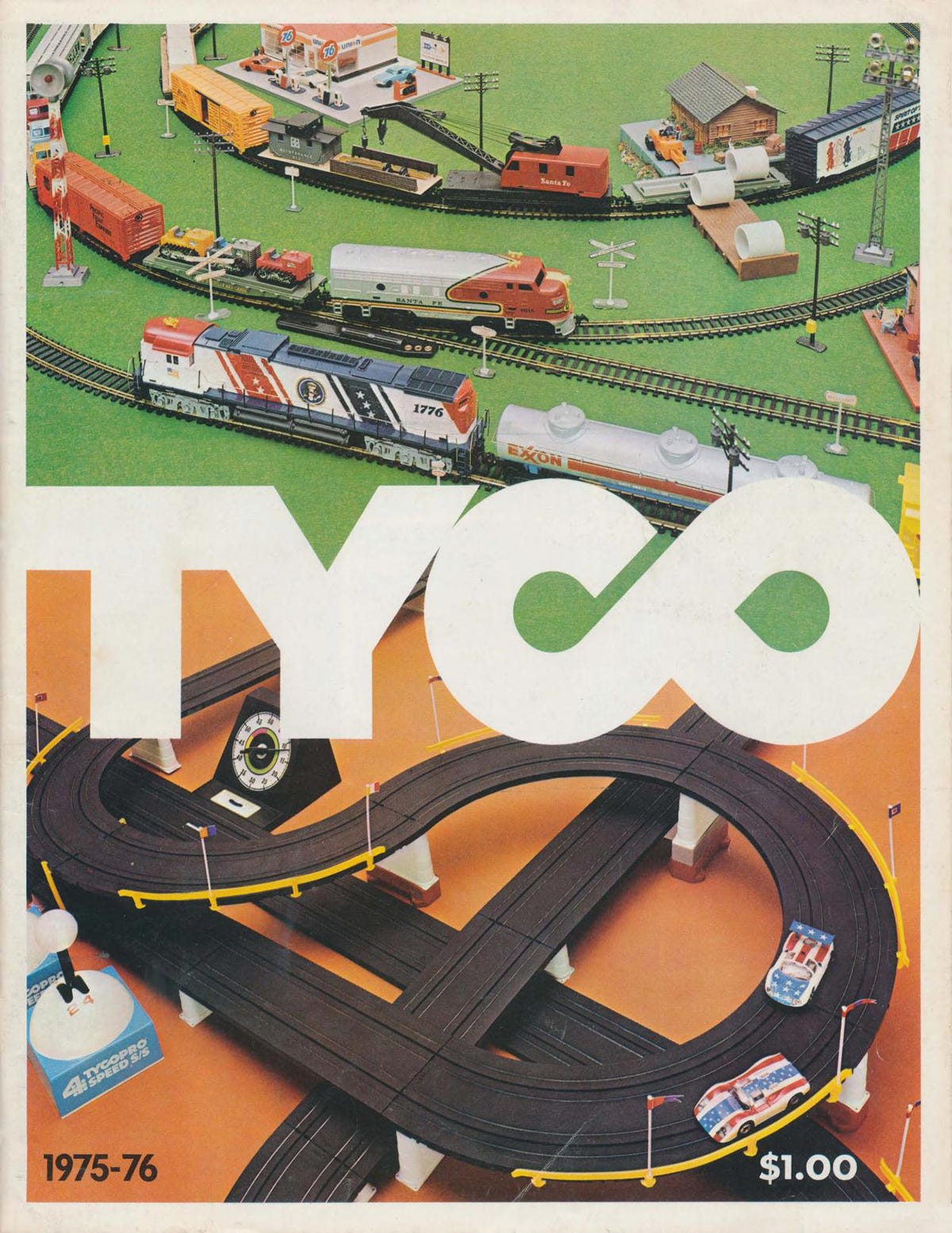
I first learned about Tyco Toys from a YouTube video on the history of Lego. Tyco Super Blocks were one of their competitors in the ’80s and the ads featured in the video boasted about their superiority. The ads didn't necessarily catch my eye, but the logotype did: An ultra bold geometric 4-letter word with 2 ligatures in it, one of them (the CO) a tiny gap shy of becoming an infinity symbol. My excitement was immeasurable.
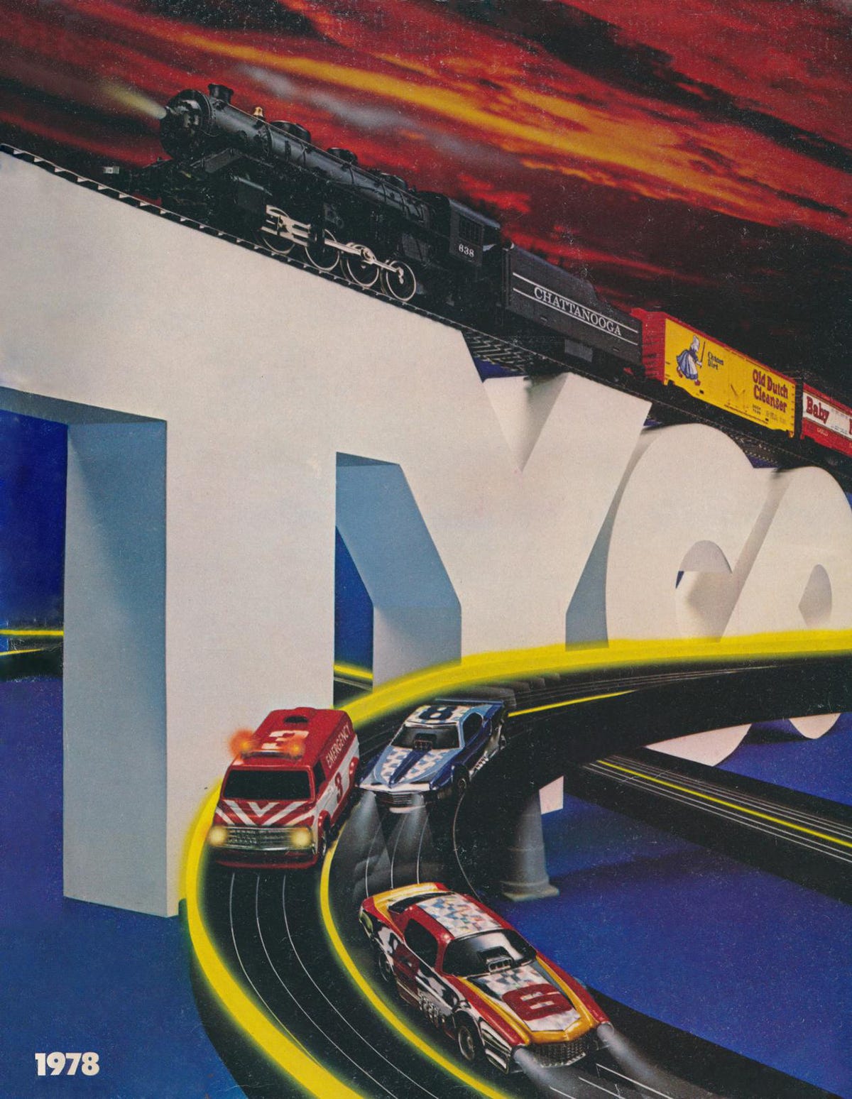
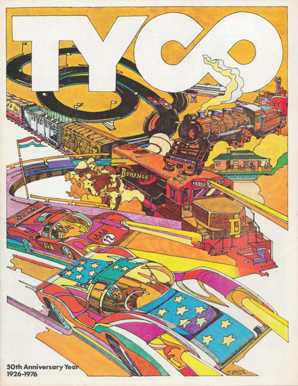
As I was looking for the logo online, a whole new world started unraveling itself. The Internet Archive has a big collection of Tyco catalogs ranging from the '60s to the '80s. They often feature the logo very prominently on the cover as it adapts itself to the art style around it. On one cover it gets a hand drawn outline, on the next one it serves as a divider between two worlds of toys and on yet another one it becomes part of the backdrop as a physical prop for the photo shoot. (On the 1978 cover it serves as a bridge AND as a divider.)
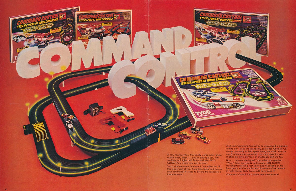
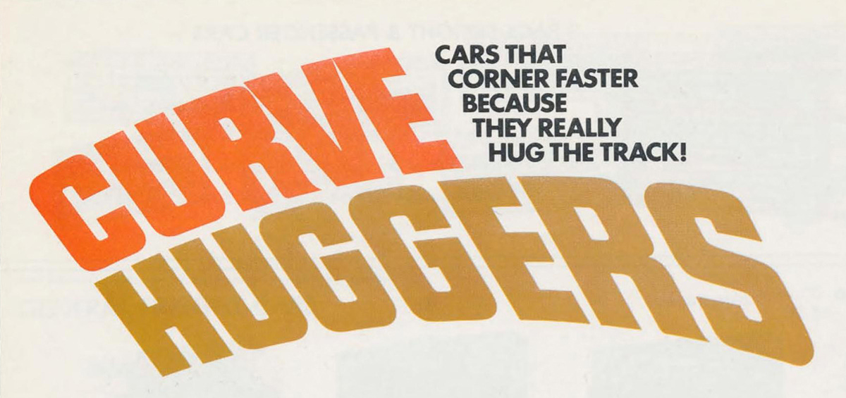
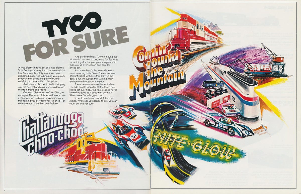
A look inside the catalogs reveals more type love from Tyco. The Chattanooga Choo- Choo, Curve Huggers and Nite-Glow each have their own distinct logotype. There's also whole spreads were the headlines become intertwined with the toys shown on the pages. Not only does it look really cool, it also helps establish more depth to the images, as the letters align with the vanishing points of the different compositions. It's always exciting to see type treated with this much care, as it helps paint a more nuanced picture and adds to the immersion of the world being built in front of you.
Vedad’s featured archive is Fonts In Use. It's one of the best places to explore how fonts are used in the real world and has entries dating back to the 1500s. It's also one of the most promising starting points when trying to identify unknown fonts.
Sources: Author’s scans
This excerpt is provided for preview purposes. Full article content is available on the original publication.