Why Does Development Slow?
Deep Dives
Explore related topics with these Wikipedia articles, rewritten for enjoyable reading:
-
Edward Tufte
14 min read
The article directly references Tufte and his book 'Visual Display of Quantitative Information' as foundational to the author's argument about data visualization. Understanding Tufte's principles of information design and his influence on how we present quantitative data provides essential context for the article's graphical approach to explaining software development slowdowns.
-
Technical debt
11 min read
The article's core thesis about trading 'options' (future flexibility) for features is essentially describing technical debt, though it uses different terminology. Understanding the formal concept of technical debt, coined by Ward Cunningham, would give readers the broader industry context for the 'feature vs. options' tradeoff being discussed.
-
Real options valuation
14 min read
The article frames software optionality using economic options language ('burning options', 'restoring optionality'). Real options valuation is the formal financial theory behind treating strategic decisions as options with value. This provides the theoretical foundation for understanding why preserving future choices has quantifiable economic value in software projects.
Why does software development start out fast, then slow to a crawl? Why does this happen faster when coding with a genie? What can we do about it?
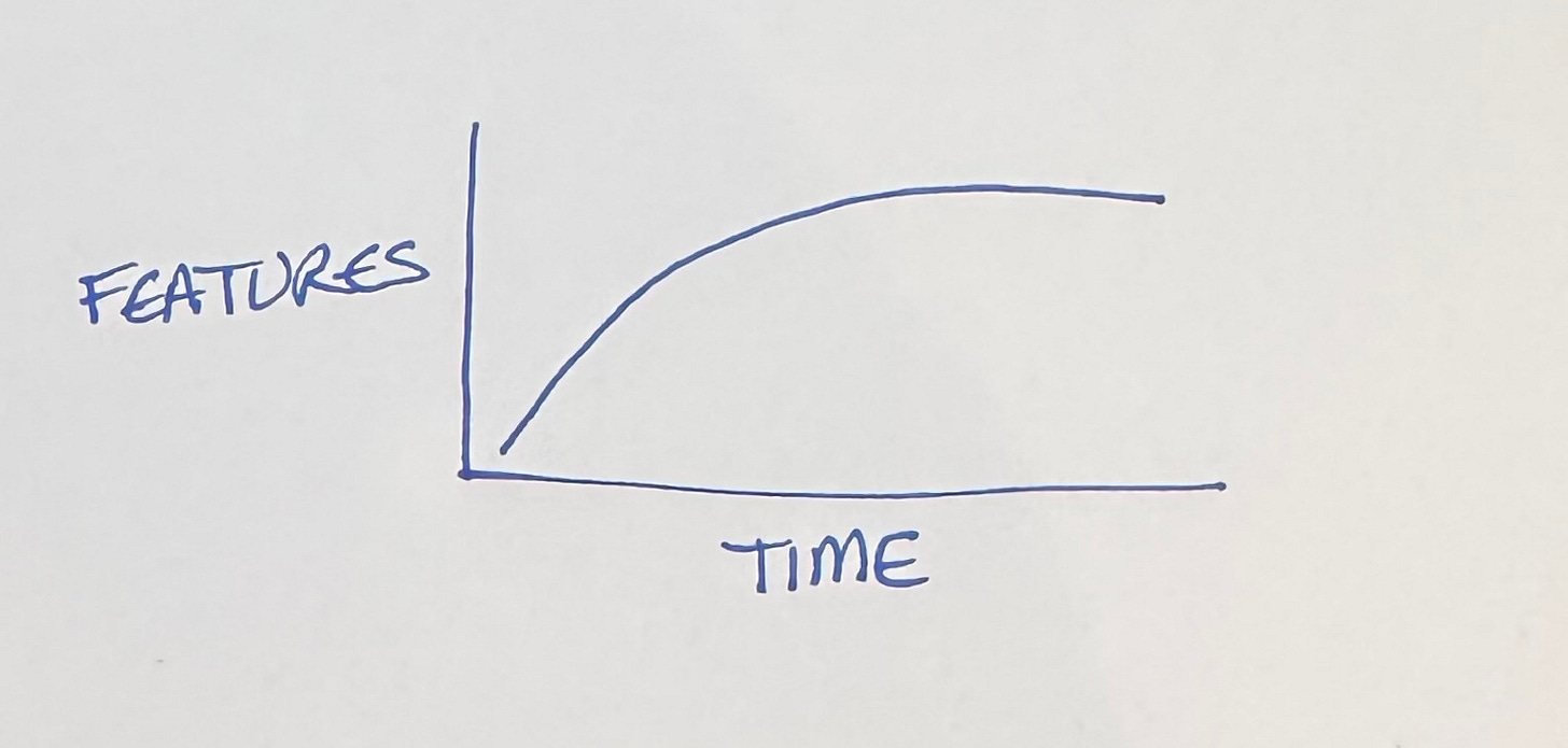
We’re going to play with graphs here for a second. The simplest way to look at our conundrum is to watch the features over time.
Rapid progress at first, then stagnation despite our best efforts. Bugs pile up. The build slows. Backwards compatibility imposes its own tax on progress. Original team members move on, while new members take time to acclimate.
What’s to be done? Is this just the price of progress?
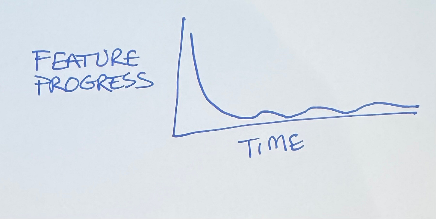
Let’s take the first derivative of features, feature progress over time.
Starts out gangbusters, then devolves to occasional bursts of productivity. We’re no closer to a diagnosis or a treatment. We just know that coding with a genie compresses time.
Scatterplot
The typical time series plot fails to generate understanding because it implies that the only source of change in the response is the unrelenting, impassionate drumbeat of time. Show cause. Show effect. — reader of Edward Tufte’s site.
Edward Tufte in Visual Display of Quantitative Information laments that most graphics are time series. If you want to understand the relationship between two variables, you need to plot them with each other, not just as part of the same timeline.
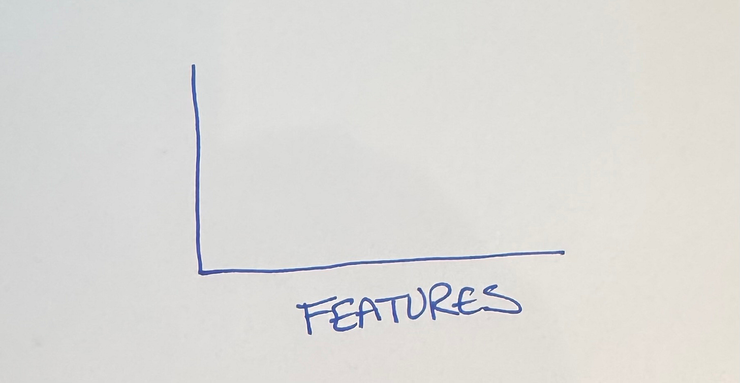
We want to understand feature development, so that needs to be one of the axes. I’m going to put it on the horizontal axis, for reasons that will become apparent (I tried it every which way before settling on this—I’m giving you the abridged version).
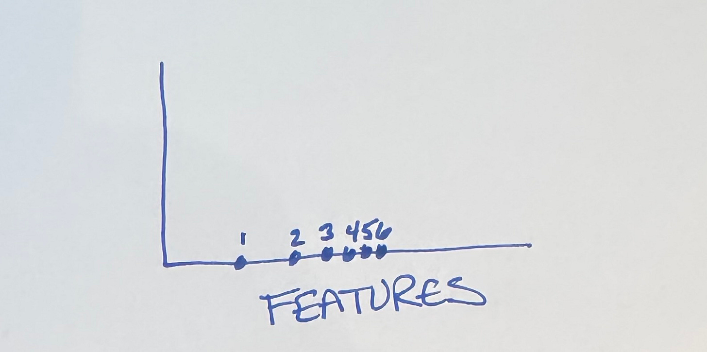
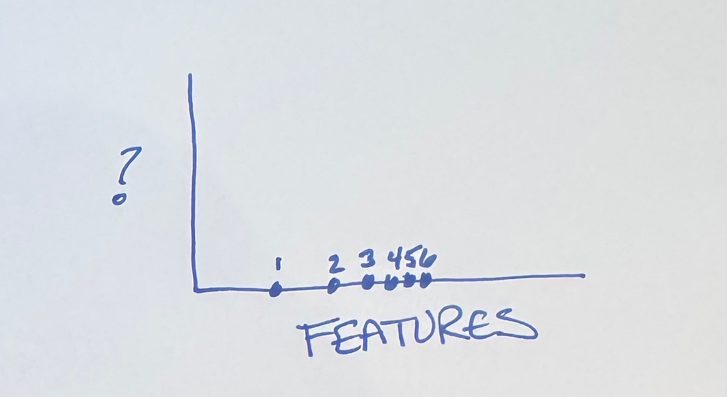
If all we’re looking at is feature progress, we expect progress to be spread apart (fast) at first, then bunch up as time passes.
But what goes on the vertical axis?
Options
No big surprise here, my fellow Tidiers. We know that software embeds economic value 2 ways:
Cash flow from current features
Optionality for future features
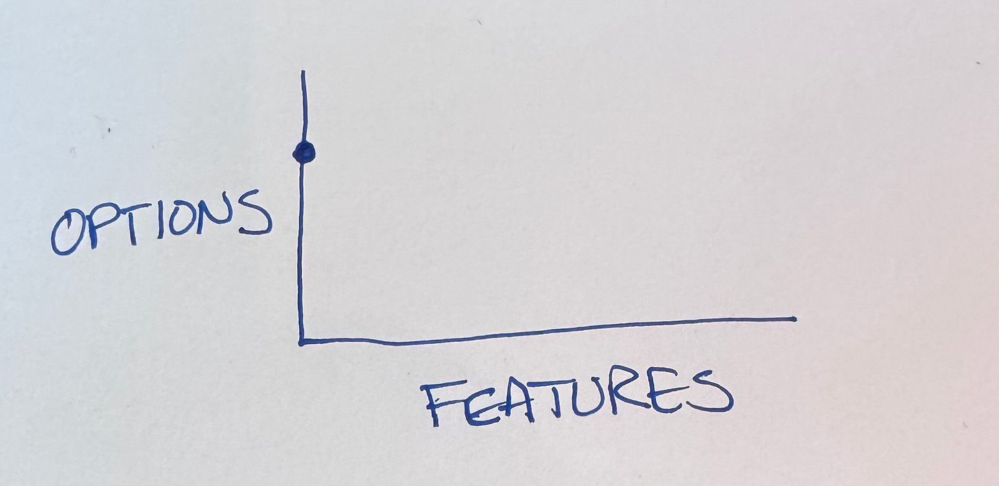
Let’s see how this plays out. We start out with no features & lots of options:
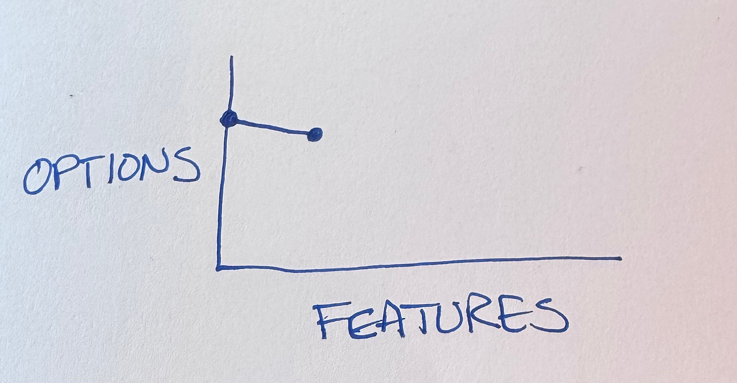
The first feature we develop goes pretty far but inevitably it burns options.
The code is now more complicated, we have to either preserve backwards compatibility or tear out the feature before proceeding.
(I hear the “why not make it better on both axes at once?” crowd. Make it run then make it right. My brain isn’t big enough to do
...This excerpt is provided for preview purposes. Full article content is available on the original publication.
