Why Radio Buttons Should Always Have Borders
Deep Dives
Explore related topics with these Wikipedia articles, rewritten for enjoyable reading:
-
Fitts's law
10 min read
This foundational UX principle explains why larger click targets (like bordered radio buttons) are faster and easier to select - directly relevant to the article's argument about clickability
-
Gestalt psychology
13 min read
The article discusses visual grouping and how users perceive scattered text as 'mangled clusters' - Gestalt principles of proximity, similarity, and enclosure explain why borders help users process form options
-
Cognitive load
13 min read
The article explicitly mentions that borderless radio buttons require too much 'cognitive effort' - this Wikipedia article explains the psychology behind mental processing limits in interface design
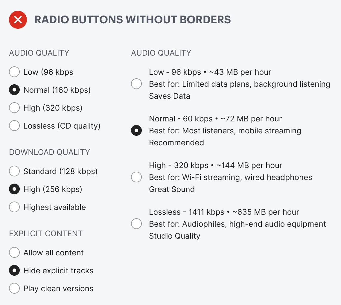
Why Radio Buttons Should Always Have Borders
Do your radio buttons have the best user experience? Chances are, they don’t because they don’t have borders. If they don’t have borders, you’re likely making it hard for users to select options on forms and in settings.
Borderless radio buttons have no container for the text label. This makes the radio buttons harder to notice, read, and click. Just take a look at the example below. The options look like a cluster of mangled text scattered across the screen. You have to hone in on the details to read and process each option. Selecting an option shouldn’t require this much cognitive effort.
This excerpt is provided for preview purposes. Full article content is available on the original publication.