Designing 'One Hundred and One Dalmatians'
Welcome! Glad you could join us. We’re here with another issue of the Animation Obsessive newsletter, and this is our plan:
1. On the visual design of Disney’s Dalmatians.
2. Animation newsbits.
With that, let’s go!
1. Modernizing Disney
At the time, it felt unique. There wasn’t another Disney film that looked like it. And, really, that uniqueness survives today: Disney hasn’t quite copied it since.
One Hundred and One Dalmatians (1961) was a huge deal. Reportedly, it was “the first animated feature to earn more than $10 million on its initial release.”1 Which was exciting, because the project was an experiment. For one, the story was set in the mid-century when the mid-century was new. And there’s that design.
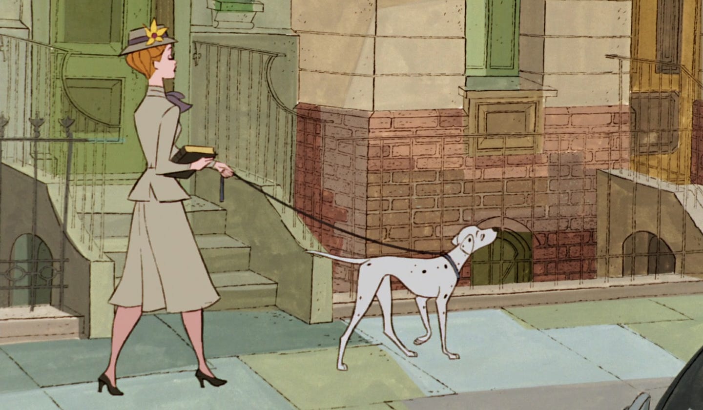
Everyone knows the Dalmatians style. This is a world of angular shapes, color blotches and scraggly, spidery lines. It’s a world of drawings — the team made no effort to hide them. That was unusual in Disney features.
The thing was, Walt Disney wasn’t crazy about drawings. As early as 1930, he’d chided his animators for bringing characters to complete stops. “[H]e said that is the worst thing about the kind of animation you guys are doing,” recalled one artist. “Your character goes dead and it looks like a drawing.”2
At Disney’s studio, hard pauses were replaced with constant motion. The illusion of life, in which viewers forget that they’re watching artwork, was the key. His team minimized black outlines for the same reason. “Every line was a soft line and [Walt] was doing his level best to make it like live action,” said artist Ken Anderson, one of the studio’s major people.3 As Anderson explained:
[Walt] hated to see a drawing on a screen. He wanted to see them disguised ... he was the one who really pushed us into cel-paint ink lines, where the ink line is the same color as the area it is encompassing.
By the mid-century, though, Disney’s visual ideas were old-fashioned. Graphic artists like the UPA crew updated animation in the ‘40s and ‘50s. The new wave “embraced the fact that cartoons were, in fact, a visual composition of lines and shapes drawn upon and seen in two dimensions,” according to the book Cartoon Modern.4
Fresh approaches to color, shape and line filled UPA gems like
...This excerpt is provided for preview purposes. Full article content is available on the original publication.