How to Simplify Large Menus with Bento Box Grids
How to Simplify Large Menus with Bento Box Grids
Many websites and apps today feature extensive navigation menus that are overwhelming to scan and navigate. In one click, users are inundated with a barrage of items, subitems, and categories. They may eventually find what they're looking for, but it's never a pleasant or seamless experience.
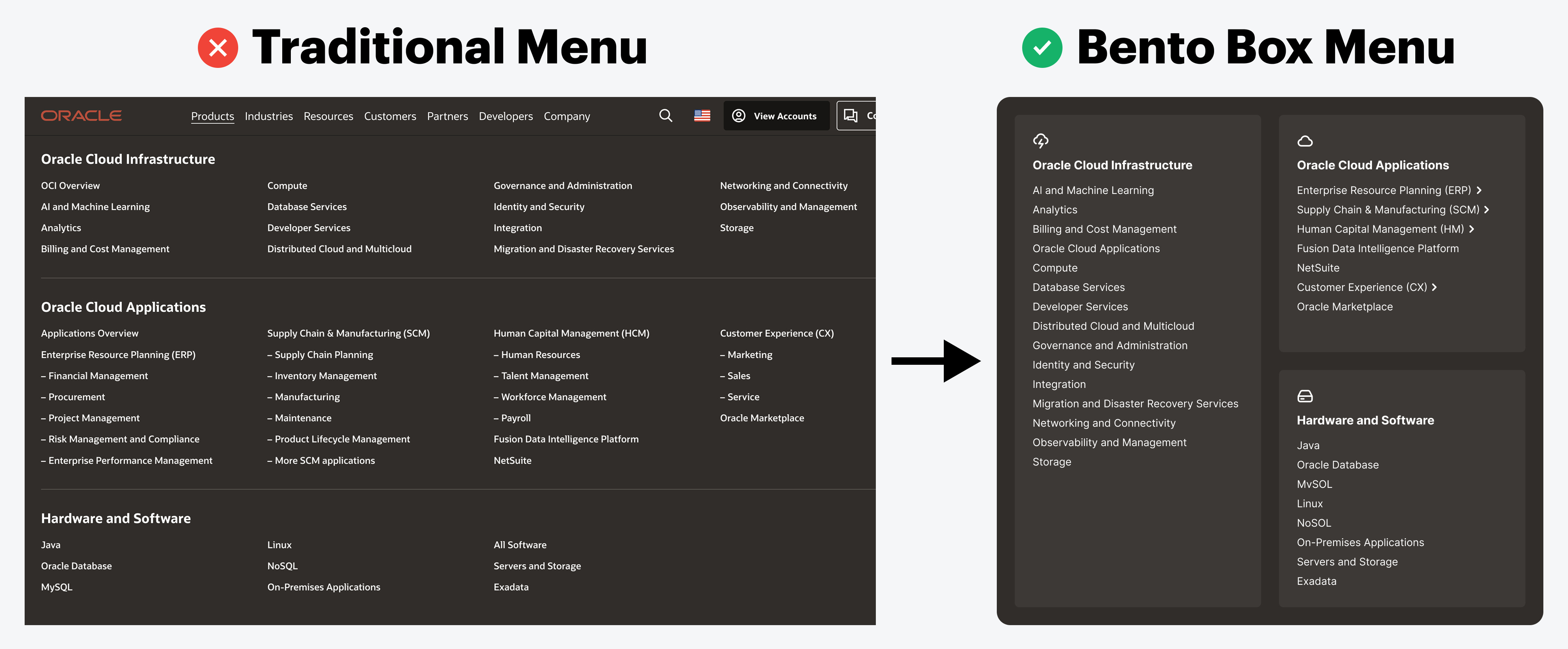
Users prefer to navigate menus with far less time and cognitive effort. However, when you have numerous items and categories, it's challenging to create an intuitive design. Traditional lists and layouts won't suffice. For this reason, your menus need to adopt a bento box grid.
A bento box grid can simplify large, mega menus into a more manageable layout. Not only is the menu less overwhelming and easier to scan, but accessing overview pages and subitems is much faster.
This excerpt is provided for preview purposes. Full article content is available on the original publication.