9 charts that show the economy is kind of a mess right now
Prices rose by 7.1 percent over the last year, the Bureau of Labor Statistics (BLS) announced yesterday. That’s the lowest annual inflation rate we’ve seen this year, but it’s still far above the Federal Reserve’s 2 percent target. Markets expect the Fed to announce a 0.5 percent interest hike this afternoon to help bring the inflation rate down.
The last time I wrote about the inflation situation, ahead of the Fed’s September meeting, inflation was surging out of control. At that point it seemed clear that rapid rate hikes were needed to bring inflation down. That’s exactly what we’ve gotten, with four 0.75 percent rate hikes since May.
Today the economic signals are more mixed. Some data suggests that the economy is slowing rapidly and may be headed for a recession. But by other measures the US economy is still firing on all cylinders.
Below are nine charts to help you understand this complex and fast-changing picture. Some of them will be familiar from my September story. But with three additional months of data, they may tell a different story than last time.
1. A good start, but not enough
Headline inflation peaked at around 9 percent in June and has come down fairly steadily since then. That suggests that the Fed’s rate hikes are working and it might be time to stop hiking soon.
However, core inflation—which excludes volatile food and energy prices—has held relatively steady at around 6 percent over the course of 2022. That suggests a less optimistic interpretation: that rate hikes have accomplished little more than preventing further escalation in the inflation rate.
Throwing out food and energy is a bit arbitrary, especially since those are two of the most significant items in many people’s budgets. So the Cleveland Fed computes median inflation, which tries to ignore volatile outliers in a more rigorous way by focusing on the CPI component in the middle of the inflation distribution. The latest reading, from October, shows inflation continuing to increase—an ominous sign for the Fed.
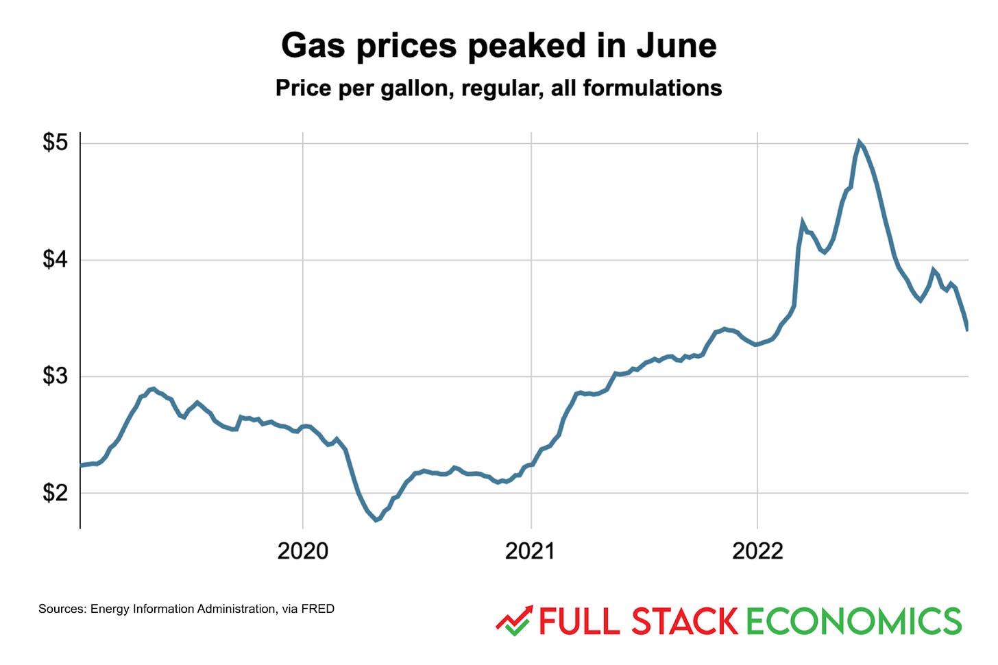
2. Gasoline prices have been falling since June
If I had to pick one chart to explain why inflation has fallen since June, it would be this one. Gasoline prices nationally peaked at $5 per gallon in mid-June. Not coincidentally, inflation peaked at 9.1 percent that same month.
Gasoline accounts for around four percent of the average American household’s budget, and hence
...This excerpt is provided for preview purposes. Full article content is available on the original publication.

