The Law of De-Emphasis for Clean UI Design
Deep Dives
Explore related topics with these Wikipedia articles, rewritten for enjoyable reading:
-
Gestalt psychology
13 min read
The concept of visual hierarchy and emphasis in UI design directly stems from Gestalt principles of perception, which explain how humans group and prioritize visual elements
-
Dieter Rams
1 min read
Rams' 'Ten Principles for Good Design' fundamentally shaped the minimalist, clean design philosophy discussed in the article, particularly his principle that good design is as little design as possible
-
Signal-to-noise ratio
14 min read
The article's core concept of de-emphasis versus clutter is essentially about maximizing signal-to-noise ratio in visual communication, a principle borrowed from information theory
The Law of De-Emphasis for Clean UI Design
When you think of a “clean” interface, what comes to mind? People often associate it with a design that’s easy to use and look at. However, designers may find it challenging to create an interface that embodies this abstract concept.
A truly “clean” design is achieved through the art of de-emphasis. Most designers overemphasize elements, resulting in a cluttered, overwhelming interface. The example below illustrates this perfectly.
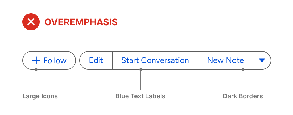
There are only five buttons, but it feels like there are more. The buttons may work, but they aren’t pleasing to look at or use. The emphasis should be applied to the most important element, while everything else should be de-emphasized. Here, everything is emphasized.
This excerpt is provided for preview purposes. Full article content is available on the original publication.