Are People Really Less Conscientious?
Thank you for reading our work! Nominal News is an email newsletter read by over 4,000 readers that focuses on the application of economic research on current issues. Subscribe for free to stay-up-to-date with Nominal News directly in your inbox:
If you would like to support us in reaching our subscriber goal of 10,000 subscribers, please consider sharing this article and pressing the like❤️ button at top or bottom of this article!
Last week, we discussed how to avoid ‘click-bait’ economic headlines by focusing on 3 questions:
What can the metric tell us?
Is the value of the metric presented in an appropriate context and with other relevant data?
Hypothetically, what would we expect the value of this metric or data to be?
Or the more direct framing of these questions:
Why are we looking at this data?
Did the authors explain the data?
Is the data unexpected?
Let’s use these questions on an article that had significant buzz recently:
Are Younger Generations Becoming Less Conscientious?
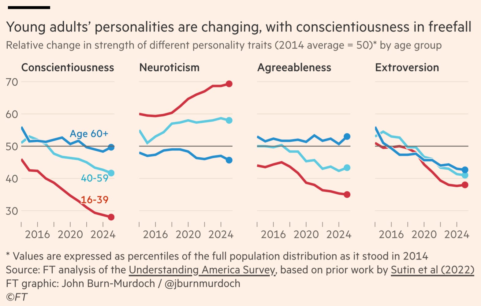
The Financial Times ran the above headline using the following chart that plotted conscientiousness, neuroticism, agreeableness and extroversion.
Question 1: What can the metric tell us?
The above four metrics are taken from survey-based questions focusing on several personality traits. The first concern that pops up to me is that this is a survey. Generally, surveys are poor methods of gathering data, because survey participants do not have any incentive to be accurate and truthful in their response. Moreover, given the subjectivity of these questions, I am skeptical whether just asking people about their personality can lead to a true reflection of their personalities.
To be clear, it is not that surveys have no place, but I would not draw important conclusions from any survey. Thus, my first reaction is skepticism.
Question 2: Is the value of the metric presented in an appropriate context and with other relevant data?
Each of the personality traits are presented in the charts over time, with conscientiousness appearing to dramatically fall for the 16 to 39 age group. The way the data is presented is described as follows in the chart:
“Values are presented as percentiles of the full population distribution as it stood in 2014”.
I don’t understand what this means (if you do, feel free to drop a comment below). A convoluted way of presenting data, raises a red flag for me – a metric
...This excerpt is provided for preview purposes. Full article content is available on the original publication.