Why Bright Button Colors Fail Accessibility
Deep Dives
Explore related topics with these Wikipedia articles, rewritten for enjoyable reading:
-
Web Content Accessibility Guidelines
15 min read
The article references the 'level AA accessibility standard' and contrast ratios - WCAG is the actual technical specification behind these requirements, with a rich history of development and specific technical criteria readers would benefit from understanding deeply
-
Color blindness
13 min read
The article mentions color blindness as a key accessibility concern but doesn't explain the biology - understanding the different types (protanopia, deuteranopia, tritanopia), their prevalence rates, and how they affect color perception would give readers concrete knowledge about who they're designing for
-
Contrast (vision)
11 min read
The article centers on contrast ratios but doesn't explain the underlying vision science - this Wikipedia article covers how the human visual system perceives contrast, Weber's law, and why certain color combinations are harder to read, providing the scientific foundation for accessibility guidelines
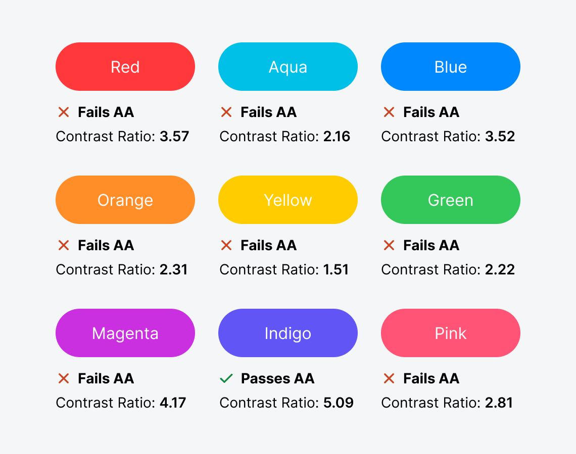
Why Bright Button Colors Fail Accessibility
Are you using a bright color on your buttons? You might not know this, but your users could be having trouble reading the text labels. If they have difficulty reading them, they won’t feel comfortable clicking them to complete their tasks.
Brightly colored buttons with white text labels are inaccessible to users with visual impairments. This includes color blindness and low vision, which commonly affects the elderly.
To check your button accessibility, use an online color contrast calculator to calculate the contrast ratio. It needs to be 4.5 or higher to meet the level AA accessibility standard. Unfortunately, most bright button colors fail the test.
This excerpt is provided for preview purposes. Full article content is available on the original publication.