How to Simplify an 18-Field, 2-Column Form
Deep Dives
Explore related topics with these Wikipedia articles, rewritten for enjoyable reading:
-
Hick's law
11 min read
This psychological principle explains how response time increases with the number of choices, directly relevant to why 18-field forms overwhelm users and cause abandonment
-
Cognitive load
13 min read
The article discusses how multi-column layouts force users to scan both vertically and horizontally, which is fundamentally about cognitive load theory and working memory limitations
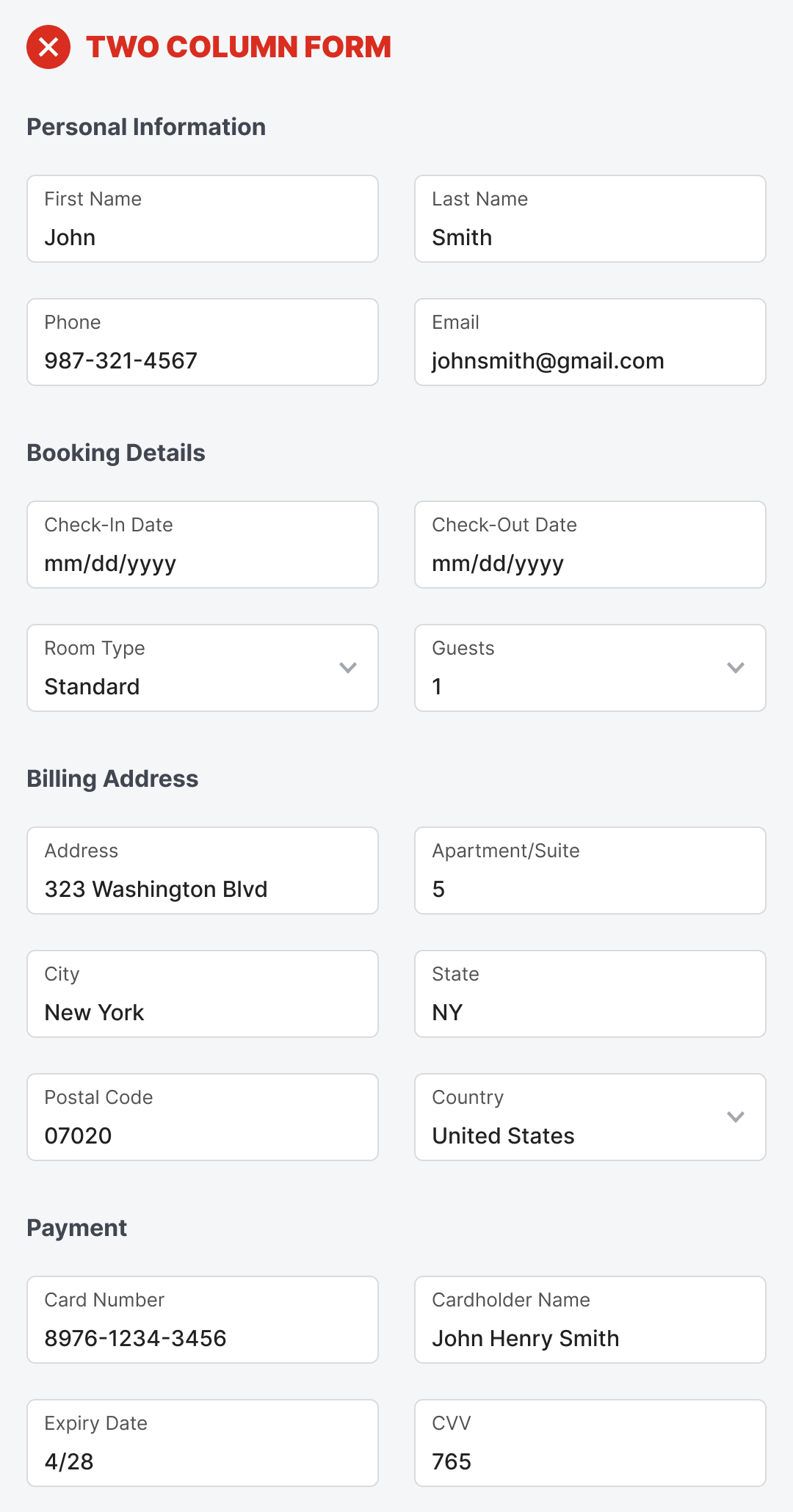
How to Simplify an 18-Field, 2-Column Form
A form with eighteen fields and two columns is a dreadful sight to see. It’ll send users running for the exit and abandoning your app. What looks overwhelming to them isn’t only the number of fields, but the multi-column layout.
With two columns, users have to scan vertically and horizontally to fill out the form. The fields are overpopulated on the left and right sides. It’s almost as if they have to fill out two forms in one. In their minds, they think this is going to be a lot of work, and they don’t have much time. As a result, they change their mind about completing the form, and you lose another customer.
This excerpt is provided for preview purposes. Full article content is available on the original publication.